

Reinventing the foundational brand elements
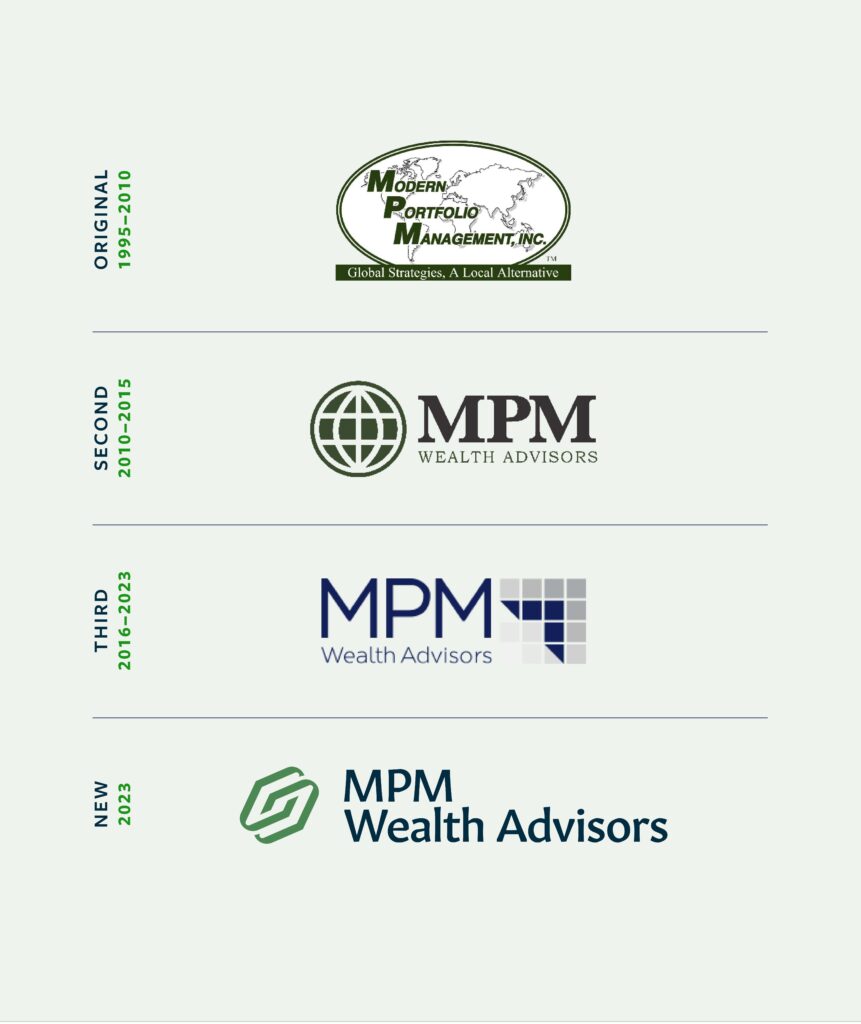
Our team got right to work. We began with a deep dive into the MPM history and values, and conducted research on other financial management brands to ensure we were crafting a unique look for MPM. Then we began exploration of a fresh logo design, color palette and typography to ensure we anchored the core brand elements. The combination of the unique MPM mark, the friendly feel of the typography, and the vibrant ‘Apple’ and ‘Sapphire’ colors inspired what came next.
20+
assets and digital properties reskinned with the new MPM brand

Introducing the new MPM
We continued down this path by designing new business cards, creating a promotional brochure and completely rebuilding the website. With each new project came exploration of more elements of the brand such as secondary accent colors, illustration style, and curation of custom photography (in partnership with the talented Grant Beachy).
